![Shinkin [ Digital ] Design](http://shinkindesign.com/wp-content/uploads/2021/11/sd-3.png)
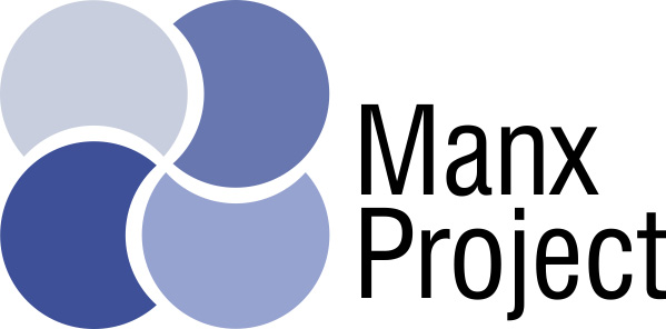
During the first ever mobile 3G implementation by NEC Japan in the UK the new telecom project required a logotype and identity. Being as the network was being built in the Isle of Man I based the idea on a Celtic ‘sun wheel’ commonly seen on the island divided into the four phases of the network build. Typography and colour … Read More
SenFocus
SenFocus is a corporate identity for a residential care facility. The logo required to depict the four essential aspects of care i.e. Cognitive, Emotional, Physical, Social each with their own related colour. Variations of the logo was produced for use in sequential PowerPoint displays. Font chosen was ITC Lubalin Graph to emphasise the interlocking jigsaw theme.
Guide Association
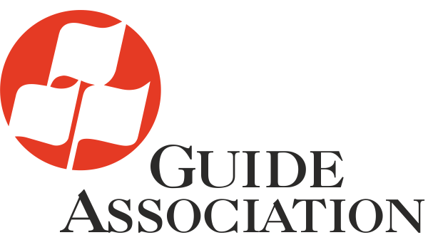
This was a project for their in-house marketing team to explore the removal of ‘Girl’ from the Girl Guide Associations name and update their trefoil logo at the same time. The three leaves of the trefoil were replaced with flags to establish the original pioneering and libertarian spirit of the Guides but still represent the three-fold promise of groups or … Read More